personal choice 5
|
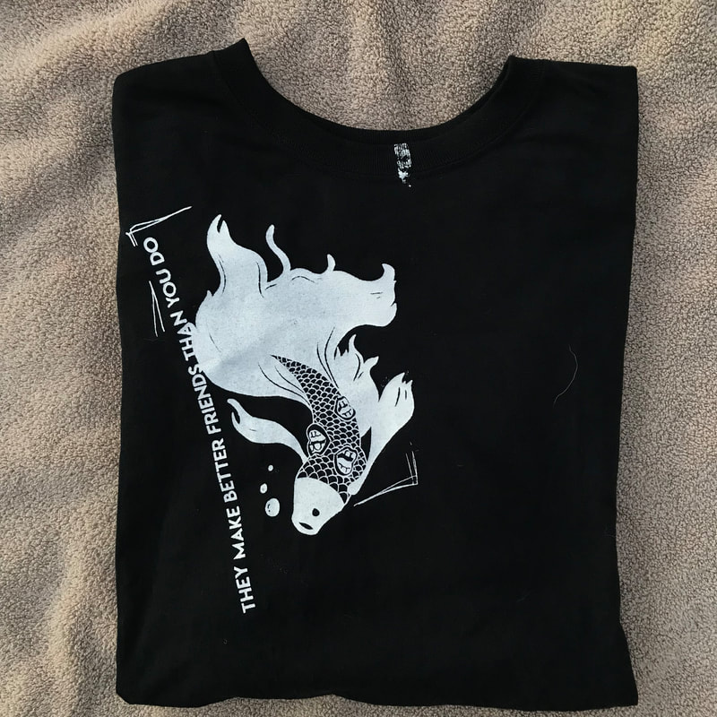
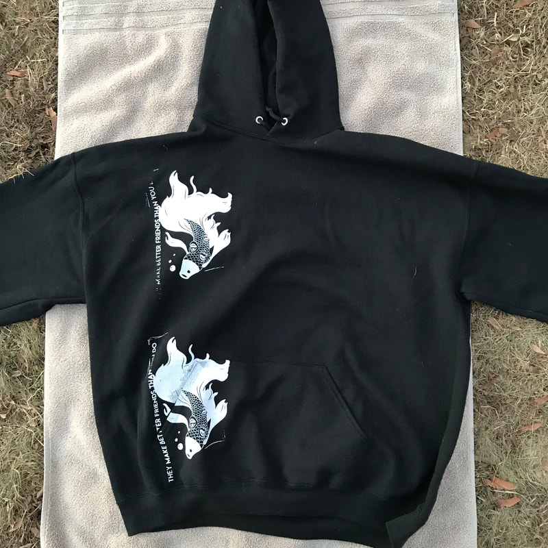
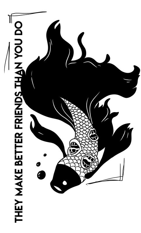
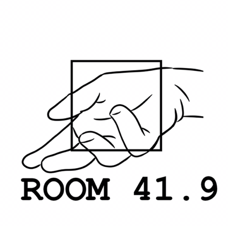
"ROOM 41.9° (THEY MAKE BETTER FRIENDS THAN YOU DO)"
DIGITAL ILLUSTRATION, PHOTO EMULSION SCREEN PRINT ON CLOTHING VARIOUS NOVEMBER, 2018 |
|
|
"ROOM 41.9° (THEY MAKE BETTER FRIENDS THAN YOU DO" is a piece that attempts to build confidence against negative individuals through imagery and word use. The imagery of an otherworldly version of something we understand is used to portray the theme of individuality and confidence in being who one is. "THEY MAKE BETTER FRIENDS THAN YOU DO" is taken from an excerpt of a song in which the performer pushes aside negative people in efforts to befriend the clouds, who make better friends than you do.
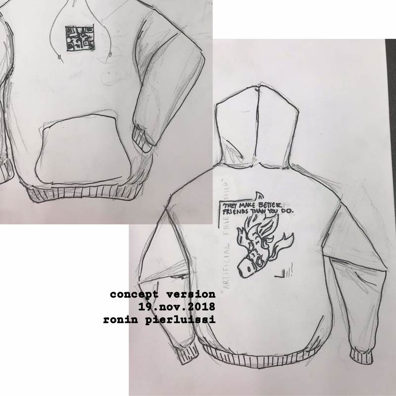
planning and inspiration
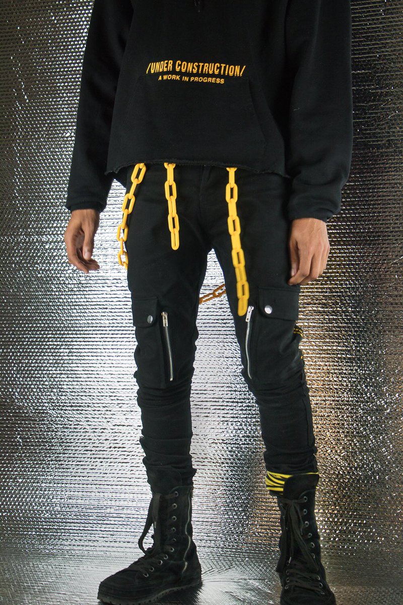
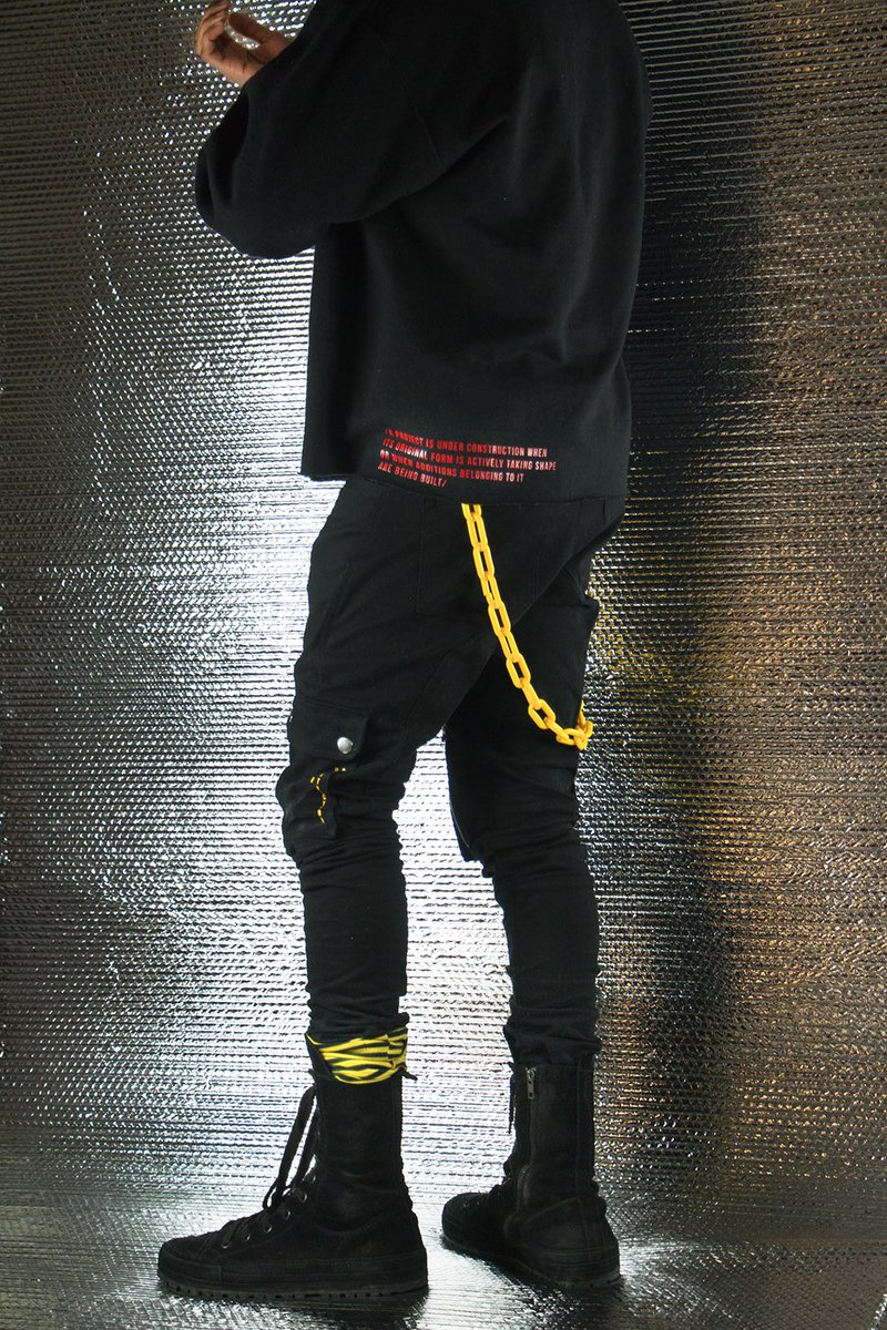
UNDER CONSTRUCTION, 2017, Sean Kelly
|
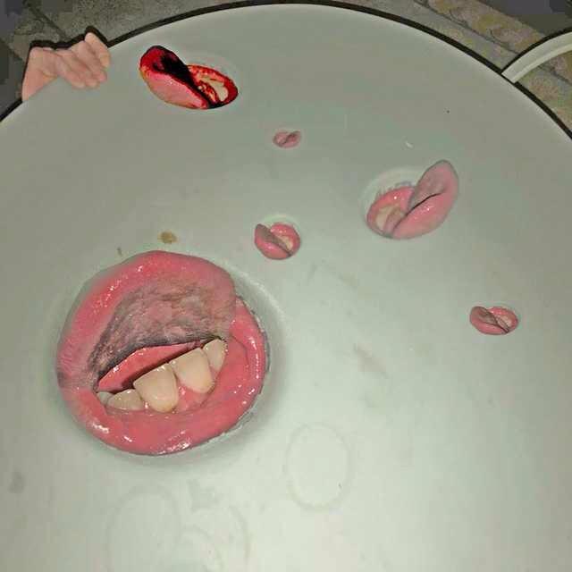
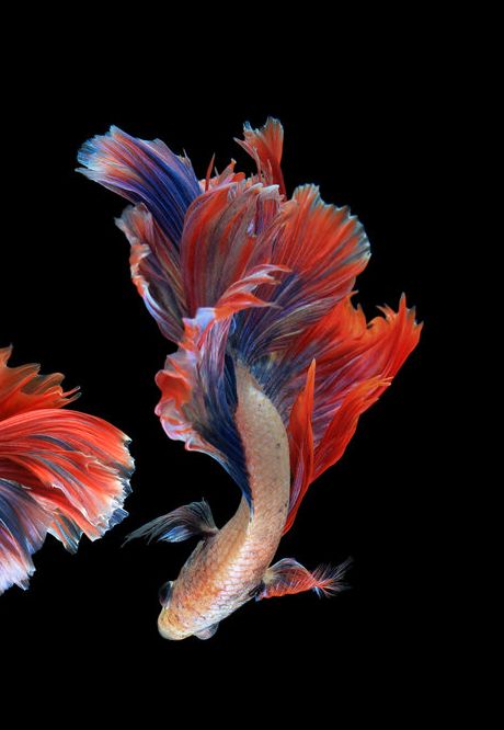
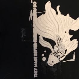
Creating the concept art for my project began within art class when the class did a form of screen printing utilizing printing paper and exact-o knives. For the project I created an image of a beta fish that utilized elements from the cover art to Death Grips' album "Year of the Snitch". The use of the repeating mouths was intriguing imagery and I wanted to utilize it within my piece to add a sense of uneasiness and to make the fish illustration seem more abstract and Lovecraftian.
When creating the plans for the illustration I took to streetwear brands and artists that I follow for inspiration on print positioning and content. I chose to pay a great amount of attention to artist Sean Kelly who makes many hand crafted pieces and who's designs for his side project "UNDER CONSTRUCTION" interested me with the placement and nature of the design. I wanted to utilize this unique placement within my own product and mocked up a sketch for what the product would look like. When creating the final pieces I ended up dropping the idea of a back print as the image was not large enough to look well as a back print, so I instead decided to make a front print that wouldn't be placed in the same place each time and would instead be unique from print to print. I also dropped the idea of a QR code as printing went on as the print never turned out well or at all. |
Year of the Snitch, 2018, Death Grips
|
|
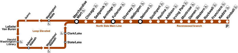
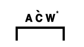
I decided to turn the branding idea into a more direct one that had meaning and imagery that I found important to myself. I decided to make the brand name ROOM 41.9°. The number 41.9° is significant as it's the first three numbers to the northern coordinates to the Rockwell Brown Line ("L" system) station in Chicago, a train I remember vividly as one that I spent countless hours on when going to Chicago for our countless visits. I used the "Courier New" typeface and added nothing more than a simple box above the words as a template. I took inspiration for this simplistic branding from the brand "A Cold Wall" whose branding is simple yet conveys the brand name efficiently in a well looking manner.
|
|
process
|
To begin the process I had to: mix, spread and set the photo emulsion with the sensitizer. To do this I mixed the sensitizer with 3/4 water and mixed thoroughly. After mixing the sensitizer I poured the solution into the emulsion bottle and mixed until the light blue emulsion was a light green. After doing so I poured the emulsion mixture into the screen and spread a light layer of it using a squeegee on both the front and back side of the screen. After doing so and removing any excess emulsion to prevent clotting I moved the screen into a cardboard box with four pins in the bottom to elevate the board should it move towards the bottom of the box. After placing the screen within the box I sealed the box with tape in order to prevent any light from entering the box that might affect the drying process of the screen. To store the screen and box I placed it under a sink within a dark room to prevent as much light exposure as possible.
|
|
|
While waiting for the screen to finish drying I began to work on the illustration and QR code that would go onto the final product. I worked within FireAlpaca to make my digital illustration. To do so I first took a picture of the sketch of the fish I had made, and imported it into FireAlpaca, resized the canvas to be the size of an A4 piece of paper and then began to trace the basic shape and form of the fish. After completing the basic outline of the illustration I worked on the finer details of the piece. I started with the fins and mouths as those would be the least repetitive and potentially the most difficult to get the form and colouration right for the printing process. After working out the colours and how the fins would look on the fish I began work on the scaling of the fish. This process took a long time as simply free handing every scale would end up looking awkward and uneven. To circumvent this I made once scale and then copy and pasted that for the row, then drew another one and copy pasted it for that row and so on and so forth until the entire body was filled. When working on the font face I chose a font that wasn't too distracting from the main piece however would also hold its own in the piece. I opted to use the Lemon/Milk font as its simplistic sans serif nature made it not a distraction but still has a presence in the overall illustration. When colouring the piece I had to remember to use only black and white, and that anything I colour black will end up being white on the article of clothing after inking.
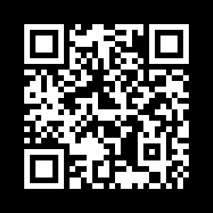
For the QR code I wanted it to be a sort of branding for my clothing piece, however I didn't want it to simply be my name or a title. Instead I chose to my branding a QR code that when scanned would lead to my art website in a sort of minimal branding. To make the QR code work on the clothing I had to invert the colours so that when printed the black portion would be white and the white would be black in order to properly print and in order to be properly read. |
|
|
Once the drying of the screen was complete and the illustrations were finished I began my process of burning the image onto the screen and preparing for my prints. To burn the image I printed out my image onto a piece of ((PLASTIC)) which had a transparent background and the black ink resting on top. I moved into a dark room and used a red headlamp in order to prevent premature exposure to the screen. I lay the positive image onto the dry screen and taped it down using duct tape. After preparing the image I plugged in a ((HOW MANY WATTS)) lamp, set it so it was directly over the image and the screen, and turned it on and left it to burn. I waited about an hour and a half before lifting the image to see if it was finished burning. After the hour and half the image had burned on more than perfectly and I took the screen to my sink in order to wash off the excess emulsion. To wash the screen I turned on the cold water, took the nozzle and sprayed the screen until the image was free of emulsion and was transparent. After thoroughly washing the screen I left it to dry in the bathtub.
After leaving it to dry I prepared my clothing for printing and got to work. I first lay the clothing out onto my table and placed a thick hardcover book inside the clothing where I wanted to print. To begin printing I had a friend hold the screen up at an angle and I poured in the white ink. I spread the ink onto the screen while elevated and then removed and stored any excess ink. I lay the screen down and had my friend hold the screen down while I applied more ink and spread it thick across the screen. After spreading the ink and removing any excess I lifted the screen while having the article of clothing be held down by my friend. After lifting the screen I removed the book from the inside of the piece of clothing and moved the clothing somewhere to dry. After finishing the printing I cleaned the ink off the screen with the spray nozzle from the sink similarly to how I cleaned off the emulsion prior. |
|
|
After letting the clothing dry for 2-3 hours I brought the clothing out again and placed a piece of parchment paper over the inked design. I then took an iron and turned it onto the heat suitable for cotton and began to 'heat set' the print. I did this for 3 minutes for every piece of clothing. After ironing the design and letting it set for about an hour I turned each of the articles of clothing inside out and put them into the dryer for 10 minutes on the highest heat in order to set them further.
To print the QR code the same method of setting the screen and burning the image was preformed, this time on a smaller screen. These prints I wanted to place on the sleeves of the hoodies and the back of the shirts. However, after many attempted prints the QR codes never came out as well as I imagined so I opted to change direction from the QR code as branding and create a new logo and name for the branding on the clothing. |
experimentation
|
Many of the first batch of prints was a lot of experimentation as it was a lot of testing what amount of ink to use per print, how to properly apply the ink and how to set the ink and wash the clothing. Many of my experimental stages came as I was working on the prints one after another and tried different things each time. I tested using a small amount of ink, a lot of ink when beginning and a little bit when doing the final application of the ink, and by using a lot of ink in both applications. By experimenting I found out that using a lot of ink at first to flood the screen and then using a small amount to do the second application was a sound method to printing my image.
Another set of experimentation was my use of line size in order to get a clear image onto the fabric. I experimented with many sizes and line sizes in order to make the design of the logo and imagery appear more prominent or more off to the side and not as imposing.
|
reflection
I believe that my project reflected my inspiration well and was successful in and of itself. There are many aspects about the project that I felt like came out very well and was exactly what I envisioned for how the project would look. Despite the setbacks in the printing and finalizing of the hoodies I believe that the final product was efficient in displaying my theme.
act questions
Clearly explain how you are able to identify the cause effect relationship between your inspiration and its effect on your artwork?
Many of the elements of positioning and layout of my own prints shows its resemblance with my inspiration, and many of the elements that inspired my illustration are effectively seen within the finalized product.
What is the overall approach the author has regarding the topic of your inspiration?
Regarding my inspiration I took imagery elements or ideas and attempted to shape them effectively into my own image that contains these elements in a manner that allows them to be seen in a new light that reflects my themes.
What kind of generalizations and conclusions have you discovered about people, ideas, culture, etc. while you researched your inspiration?
When researching my topic, especially when it came to recreating the logo for my piece I had many troubles when it came to appealing imagery that expressed a central idea and theme. When conducting my research I discovered a lot about advertising, logo creation, and other aspects of production.
What is the central idea or theme around your inspirational research?
The central theme around my project was one of individuality and finding oneself within a landscape of people finding it hard to accept others. A sort of black sheep mentality was taken with this piece, in an attempt to make something unique and different, from print to print that enforced this individualistic theme.
What kind of inferences did you make while reading your research?
When reading my research I made conclusions that helped me in the production of the prints and hoodies that helped the entire project come together and helped the process of the piece take on its own light and become something that differed from one another.
image sources
“Year of the Snitch.” Wikipedia, Wikimedia Foundation, 12 Dec. 2018, en.wikipedia.org/wiki/Year_of_the_Snitch.
“Why Do My Betta Fish Fight?” For Birds Only Pet Lovers USA, www.forbirdsonlyny.com/blog/2018/1/4/why-do-my-betta-fish-fight-with-each-other.
Chicago ''L''.org: Operations - Lines -> Stock Yards, www.chicago-l.org/operations/lines/brown.html.
“A COLD WALL.” H. Lorenzo, www.hlorenzo.com/pages/a-cold-wall.
