DRY POINT
|
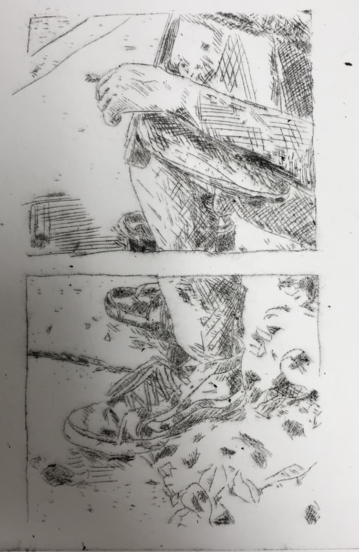
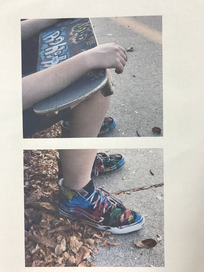
"PICTURES OF MY FRIEND BEFORE SKATEBOARDING"
DRY POINT 20x15CM OCTOBER, 2017 EXHIBITION TEXT: My dry point piece is supposed to represent youthfulness in people my age. As teenagers we spend so much time at school, doing assignments and spending time indoors that our youthfulness fades quickly, soon we'll be in college and have jobs and if we don't manage to keep hold of our energy, we won't be able to do many of the things we once loved. planning and inspirationMy original vision was to create a piece reminiscent of an Angie Hoffmeister print. I wanted to take photos of my friend and then digitally edit them so that they would all layer in a fashion like a Hoffmeister print, however this proved to be difficult with the basic editing software I had on my phone, so I instead brainstormed for an entire weekend about what I could possibly do for my dry point piece.
|
|
It came to me when a close friend and I were out skateboarding. I generally take many candid photos so I have memories to hold onto and I remember feeling wonderfully happy in that moment so I took some pictures and realized that this could be a wonderful idea for expressing the theme I wanted to connect with in this project.
My final idea was to still mix photos digitally, however it wouldn't have been as elaborate as a Hoffmeister piece, instead I was inspired by the more simplistic and minimal works of Barbra Kruger, and the photography of Ezra Petronio. Many of Kruger's artworks feel like it can convey it's meaning through just the image and without the words. The choice to ultimately use Kruger as my main point of inspiration was her ability to get a message across through only a photo and a couple words. For my piece I wanted to just use a picture I took of my friend to express my theme, however I didn't want it to just stand alone as a single picture conveying a message, so I instead took a look at advertisements and promotional photos done by Petronio, where he takes multiple photos and then collages them in a way that gives the illusion of it being one photo but in certain sections the subject will be doing another action. So I took another photo of my friend from the same day and merged them in a way that looked like it was one solid image but also two separate photos. My final product appeared to have space for lettering however I left it blank to minimize the negative space, while creating negative space for the pictures to look separated within. 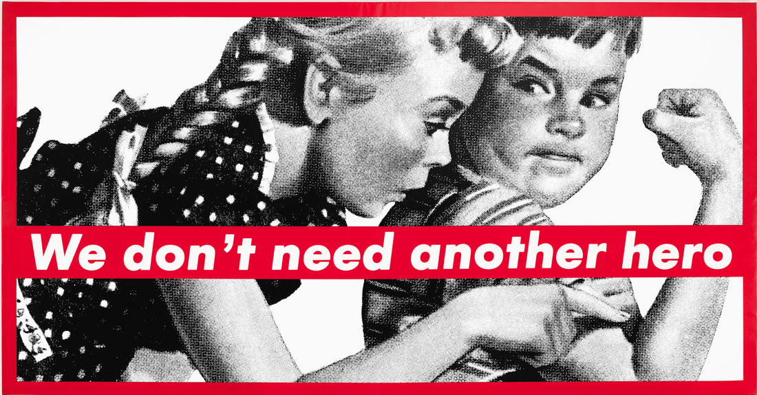
Untitled (We don't need another hero), 1986, Barbra Kruger
|
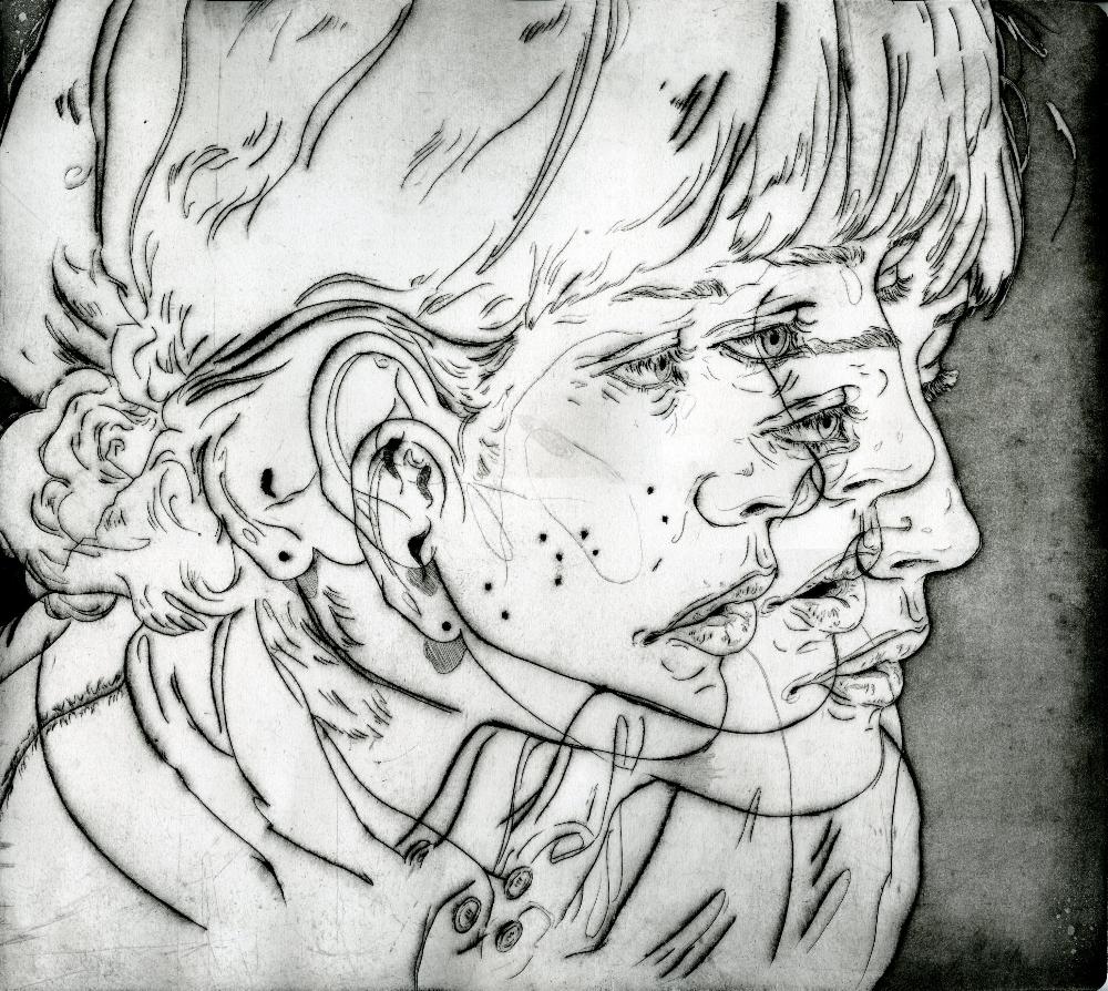
Dry Point, 2010, Angie Hoffmeister
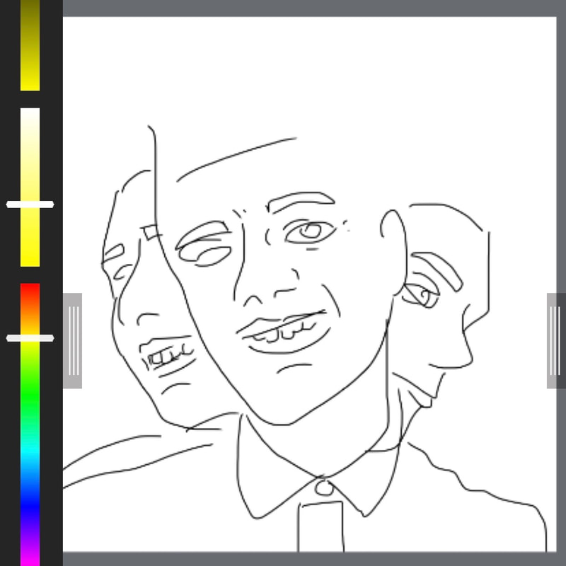
Sketch for original plan
|
|
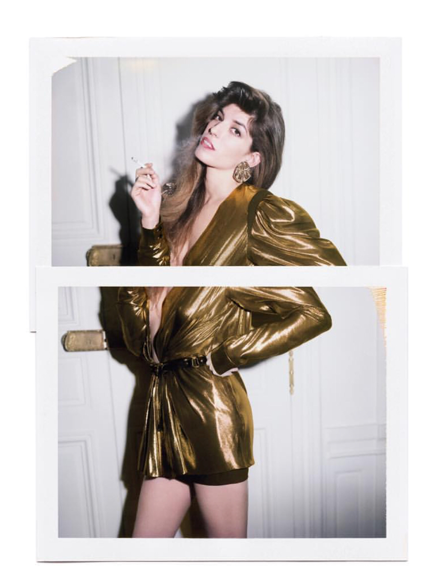
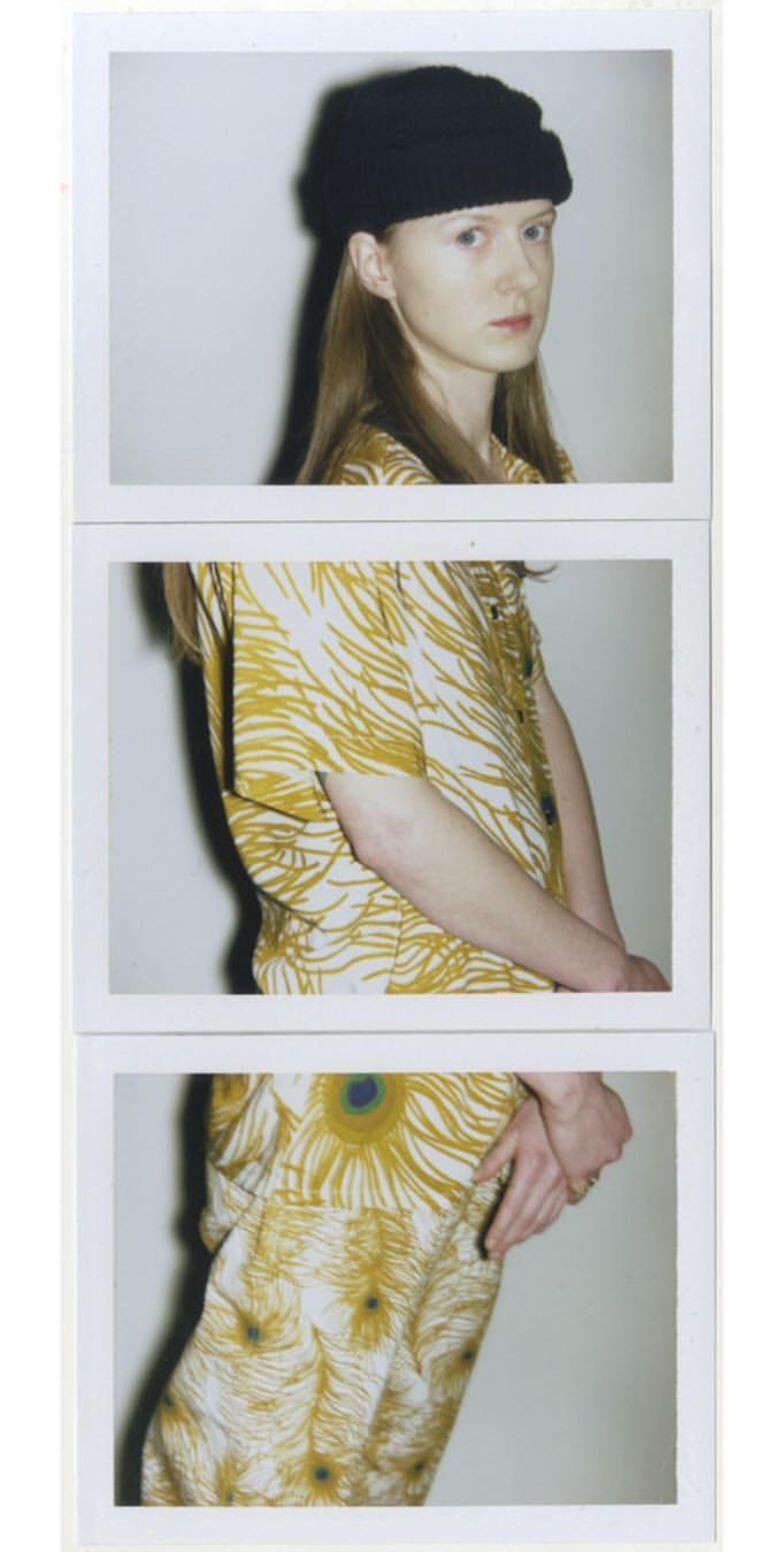
(above) Photo of Lou Doillon for Self Service Magazine, 2017, Ezra Petronio
(left) Supreme/Self Service Magazine Spring/Summer 2016 Editorial, 2016, Ezra Petronio |
process
|
To come up with my final image I had to first arrange the photos in the correct manner, to do this I used a free paint software on my computer called paint.NET, a tool with very basic photo editing tools, however it is a program I've stuck with for years and years so I've learned how to get the most out of the limited tools I have available. To begin I had to transfer the photos to my laptop, I simply emailed the images to myself and downloaded them onto my computer. From there I would create a canvas, maybe around 4096 x 4096 pixels large and then I'd drag and drop the images into the canvas, from there it was just a matter of moving the pictures around to look the way I desired. I chose to print out the final image from my father's computer printer, mostly because it gives the image a nice purple tint to it, not that it mattered in the slightest as my dry point would end up being in black and white but I felt as if it would be nice to have something more appealing to my eye to look at when carving.
|
|
|
There was some debate on my part on what image I should use for my piece. All three pictures were taken at the same time and I felt that they all displayed my theme well. When in paint.NET I experimented with the images, one plan was to take the pictures of the skateboards of each of my friends and layer them in a similar way as my final product. However I felt as if using the same friend for the entire product would feel much more consistent and would be able to reflect my inspiration well.
|
|
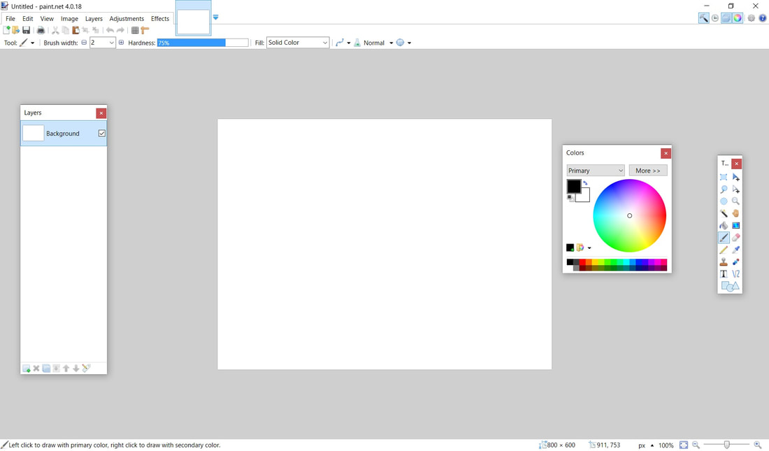
Screenshot of the paint.NET program
carving
After printing out the final image I took to carving out in preparation for printing, my piece had a lot of details, but I was pleased with it as a detailed dry point is what we were shooting for. I decided it was more important for my message to spend more time working on making sure the person in the pictures was the most detailed part of the piece, I did go into working on the leaves but I felt as if working on them too much would have been a waste of time and would have masked the details of the shoes among all of the lines. During my carving I felt as if my biggest concern was messing up, my primary go-to's for visual art are pencil and pen on paper or using my tablet for digital illustration so not having the luxury of erasing a line I already placed was a haunting idea, however I took things slowly and only messed up poorly on ending lines sometimes.
printing
For printing I think it went really well, myself and a friend both printed together and he helped me really get the printing process down. The process was a chore however and I realized very quickly that dry point ink is very thick and hard to work with, spreading it around was a challenge and I constantly wanted to add more but I realized that would make wiping if all off even more challenging. I feel like for my second print I ended up leaving too much ink on my plate and that really added smears and made my image look very dirty, however for my first print I think I wiped off enough and got a fairly good looking print down. I only ended up doing two in total as the process wasn't terribly long and I managed to get fairly good results out of each print. I did have an issue with my second print where the plate did get shifted during the rolling process but it wasn't a project ending mistake.
experimentation
During the printing portion of the project I experimented with using different amounts of ink in order to get a desired result with my final product. With my two prints the feeling changed because of my experimentation with different amounts of ink. With my prints I used largely differing amounts of ink in order to experiment with bringing out the blacks and making it look more wet, and then trying with less ink and making the image look more dry. When looking at the second print it's apparent that there was a greater amount ink used, ink smears are visible on the spaces where the pictures aren't, and many of the blacks are much deeper and more of the small details like the leaves and the cross hatching in the figure.
reflection
Overall I am very pleased with the outcome of my final project. The prints were very satisfactory in my opinion. However there were some hiccups, one of the prints had a little less ink than I wanted; and the second print through had some excess ink left on the face of the plate and it showed up after the printing process. The theme I wanted to convey I believe showed through even with the few mistakes that came through after printing.
act questions
Clearly explain how you are able to identify the cause effect relationship between your inspiration and its effect on your artwork?
The photo positions, and the style of using two different images to make one in my final product share similarities with the photograph styles of Ezra Petronio in an obvious connection. The expression of my theme through my photograph and the use of negative space also connects to the work of Barbra Kruger.
What is the overall approach the author has regarding the topic of your inspiration?
My approach was not focused on the direct ideas of inspiration however the feelings that they gave off and my own personal experiences with my own youthfulness.
What kind of generalizations and conclusions have you discovered about people, ideas, culture, etc. while you researched your inspiration?
I found out that there are many different opinions towards youth, juvenoia, the fear that the youth has on society is just one opinion that places youths in a category of being irresponsible, while other opinions cater towards praising the youth and want them to do the most they can out of their limited youthfulness.
What is the central idea or theme around your inspirational research?
My theme was the idea of youthfulness. Specifically the freedom and energy we have as youths that we don't get to keep forever.
What kind of inferences did you make while reading your research?
I had originally approached this piece thinking that it would be difficult to find much about artists who would approach an idea like mine in a way that would fit my theme. However, artists like Kruger can approach topics with a somber tone but still express a positive message; "We don't need another hero" gives off a sad sort of feeling when read, however the image does show hopefulness and determination. If I had added text I would have definitely made it express a similar feeling.
image sources
“Drypoint Prints by Angie Hoffmeister.” Colossal, 8 June 2017, www.thisiscolossal.com/2011/12/drypoint-prints-by-angie-hoffmeister/.
“Untitled (We Don't Need Another Hero) [Barbara Kruger].” Sartle - See Art Differently, 15 Sept. 2016, www.sartle.com/artwork/untitled-we-dont-need-another-hero-barbara-kruger.
“Hetty Douglas Archives.” Self Service Magazine, selfservicemagazine.com/credit/hetty-douglas/#//.
“Lou Doillon Archives.” Self Service Magazine, selfservicemagazine.com/credit/lou-doillon/#//.
