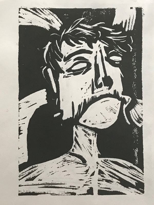
BLOCK PRINT
|
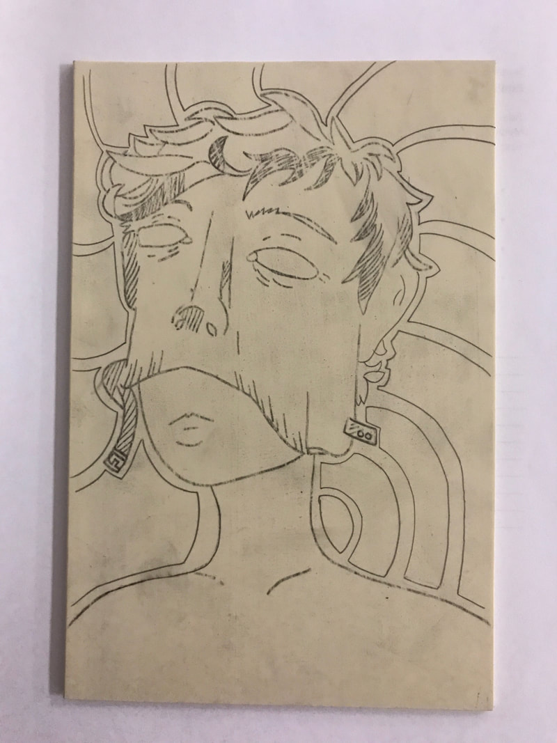
"MANNEQUIN WITH MASK ON"
BLOCK PRINT 15x23CM SEPTEMBER, 2017 EXHIBITION TEXT: This piece is meant to represent identity crisis and how sometimes you don't feel like you really are who you see in the mirror. It's a piece focused on identity as a whole. It tries to touch base on how many people feel like someone completely different on the inside then who they are on the outside. I wanted to represent this struggle of feeling like you have to put on a mask in order to fit in with the outside world. |
planning and inspiration
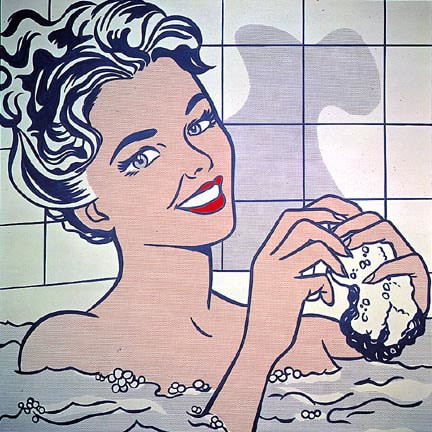
Woman in bath, 1963, Roy Lichtenstein
|
My piece "MANNEQUIN WITH MASK ON", was inspired by the comic book style of Roy Lichtenstein, and the work of Kathe Kollwitz. I chose to mix these two styles of Lichtenstein and Kollwitz because they both feel similar and yet different from each other; the very simple and more illustrative style of Lichtenstein is something I enjoy to draw and is closest to my causal style of art so choosing to do my piece like this felt right; and the sickly somber looking style of Kollwitz not only fit the medium of the piece, but made my theme easier to show as being not a very positive thing. Identity crises are not uncommon in our culture and having to hide behind a mask is an unhealthy thing but is sometimes the easiest in such a chaotic world filled with hatred and judgement.
|
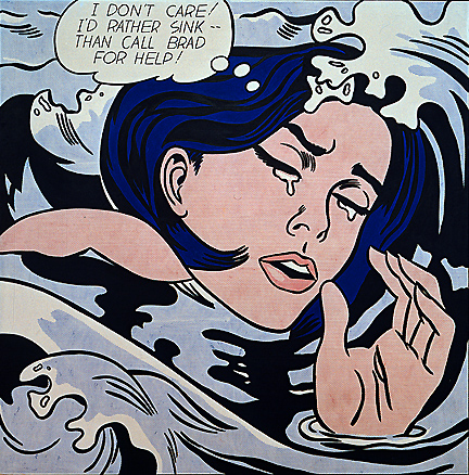
Drowning Girl, 1963, Roy Lichtenstein
|
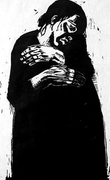
Die Witwe 1, 1921, Kathe Kollwitz
|
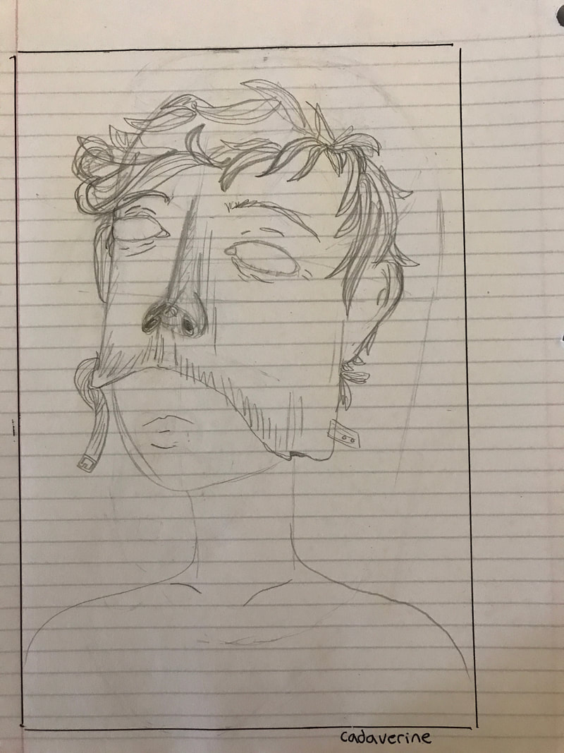
My theme and inspiration made me want to create a piece that was able to show the detail in prints from Kathe Kollwitz, but have the volume and style of pieces from Roy Lichtenstein. I took to making the base idea more styled like a Lichtenstein piece but then go in and make the carving have more detail and rough edges like a Kollwitz print. The sketch I choose to go with was one of the first ideas that came to mind, it expressed what I wanted it to and I thought that it looked good as well.
|
processThe hardest part about my block print wasn't coming up with a good sketch, it was instead creating a theme. I knew what I wanted my piece to resemble, but it wasn't until I sketched out my piece when I settled on a theme for my project.
carvingCarving was maybe the hardest part about this project. I had to be careful with my lines as to not make them too shallow, and had to make sure I kept to keeping my lines as true to the original idea as possible. As soon as I had started I realized I had made a mistake, I began carving out the figure, meaning I had to keep all of the details normal and had to carve out everything else, making more work for myself. However, I do not think it was a poor decision; sure, it was a lot of extra work, but the final product in my opinion looked a lot cooler than what it would've been, had I carved out the details and left in the negative space. The spiral in the background was a last minute choice; the background of my piece was originally empty, and I wanted to fill it with something, so I chose to add the spiral to visualize the chaotic nature of my theme.
printingThe printing process wasn't a difficult task, and it wasn't very time consuming either; the ink was easy to work with and printing was quick and easy. However, it did take me a few prints to get the hang of it. I think I did maybe 6 prints in total and only 1 came out looking like there wasn't any ink on it. Of the prints that did look good none were completely inked like I wanted, and there were some sections on the sides that didn't get inked, but other than that the entire process went well.
|
experimentation
Throughout the printing and carving process I experimented with altering my idea and vision a little bit. When it came down to carving, instead of taking the quick route of carving along the lines of my project, I instead carved out the parts I wanted to be white; this proved to be a mistake and a great idea. It became hard at a certain point to see what was carved out, however, the experimentation was a good idea in the end.
I also experimented with the amount of ink on my print. Each of the prints utilized a different amount of ink and it's apparent by the faded or blotchy look of the print. I believe that the third print turned out the nicest, even if I didn't use a lot of ink on it, because I felt that the grainy texture in the background accommodated the chaotic nature of the piece.
I also experimented with the amount of ink on my print. Each of the prints utilized a different amount of ink and it's apparent by the faded or blotchy look of the print. I believe that the third print turned out the nicest, even if I didn't use a lot of ink on it, because I felt that the grainy texture in the background accommodated the chaotic nature of the piece.
reflection
Overall, I believe my project came out in an acceptable state. Even though many places like the torso were carved out poorly and many parts of the background didn't come out completely inked, I still think the final product looks well. The torso adds a sort of sickly appearance to the mannequin's body, giving it the more gritty look of Kollwitz pieces that I was inspired by. I was also very pleased with how the lines on the mask turned out, as they followed the same style that I was inspired by in Lichtenstein's pieces.
act questions
Clearly explain how you are able to identify the cause effect relationship between your inspiration and its effect on your artwork?
The presence of the more comic book style shown by Lichtenstein shows in the shape and line work of the mask on the mannequin. In the torso of the mannequin, although it wasn't completely intentional, the rough aggressive lines are reminiscent to Kollwitz; the mask also shows hints of Kollwitz's pieces through the shading and the texture in the nose.
What is the overall approach the author has regarding the topic of your inspiration?
I tried to make my piece a more original version of the commonly used imagery of someone putting on a mask to hide their true emotions, however, I took my own twist on it that would suit my theme appropriately.
What kind of generalizations and conclusions have you discovered about people, ideas, culture, etc. while you researched your inspiration?
Many pieces during the German expressionist period focused on very human concerns about urban life and to face the disasters of WWI face first.
What is the central idea or theme around your inspirational research?
My theme was the idea of identity and the chaotic nature of hiding who you really are on the inside in order to stay safe from a judgmental world.
What kind of inferences did you make while reading your research?
I came into the project looking for a Lichtenstein piece that could easily be shaped to fit my theme, as most of his art doesn't express a darker more twisted theme; however, when looking at the details in Kollwitz's cuts I came to the conclusion that I could combine Kollwitz's twisted style through line with the more tame comic style of Lichtenstein.
image sources
“Woman in Bath.” Museo Nacional Thyssen-Bornemisza, www.museothyssen.org/en/collection/artists/lichtenstein-roy/woman-bath.
“MoMA Learning.” MoMA | Roy Lichtenstein. Drowning Girl. 1963, www.moma.org/learn/moma_learning/lichtenstein-drowning-girl-1963.
“The Widow I, 1921 - Kathe Kollwitz.” Www.wikiart.org, www.wikiart.org/en/kathe-kollwitz/not_detected_235984.
“MoMA Learning.” MoMA | Roy Lichtenstein. Drowning Girl. 1963, www.moma.org/learn/moma_learning/lichtenstein-drowning-girl-1963.
“The Widow I, 1921 - Kathe Kollwitz.” Www.wikiart.org, www.wikiart.org/en/kathe-kollwitz/not_detected_235984.
